Widget
The graphical component to visualize the selected data. This means that data is recorded more clearly and analysis is simplified.
- Select a Widget.
- Depending in the selected KPI type, the corresponding available widgets are displayed, see KPI.
- Overview of widgets:
Legend | Function / Option | Description |
1 |
| Number: Displays a single metric value. This varies depending on the setting of the report options. Useful for a quick overview of a specific, absolute value. The Number display type is extended by the alarm configuration by mail, see Alarm Configuration. |
2 |
| Spline: Shows data points on a smooth line. The x-axis describes the time and the y-axis the characteristic. Useful for trend analysis. |
3 |
| Simple Bar: Data as an bars. Each bar represents a category, the height of the bar corresponds to the value of the category. Useful for displaying comparisons between different categories. |
4 |
| Stacked Bar: Data as an bars. Bars are stacked to display the sum of several values. Useful to visualize the contribution of each category to the whole. |
5 |
| Doughnut: Pie chart variant, display of the data points in ring segments around the central area. Each segment represents a certain proportion of the whole. Useful for visualizing percentage distributions. |
6 |
| This display type is only available for the KPI Agent compared. Speedo meter: Displays the evaluation keys defined in the scorecard settings in color. This visualization uses a coloured area, similar to a speedometer in a vehicle, see Edit Scorecard. |
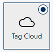
7 |
| This display type is only available in the KPI area Analytics reports. Tag Cloud: Shows categories as a text cloud. More frequent categories are displayed larger, less frequent categories smaller. This visualization is useful for quickly identifying the most common terms or topics within conversations. In the detailed presentation in Entry list, the policy hits are listed by frequency. |
8 |
| Pie: representation of data points as segments of a circle. Each segment represents a certain proportion of the whole. Useful for visualizing percentage distributions. |


View Option
The view option describes the parameter under consideration. The selection of the view option is displayed dynamically. The view option is preset depending on the KPI and display option.
- Click in the field View Option.
Depending on the selected KPItype and the selected widget, the view options offer one or several of the following options: | ||||
Number | Overview of numerical data, concentration on concrete numerical values. | |||
Time | Temporal development of data or time-related insights into activities. | |||
Keymap | Percentage distributions or proportions in the data. You can recognize patterns or trends. | |||
User | Activities or performance with regard to users or groups. | |||
Total | Overall view of the data without specific filters or restrictions. | |||
Examples:
- The widget the widget Number only shows the view option Number, as it is a single metric value.
- The widget Spline only offers the view option Time as an evolution over time is supposed to be displayed.